

 Close Menu
Dheeraj Sharmaa

Business
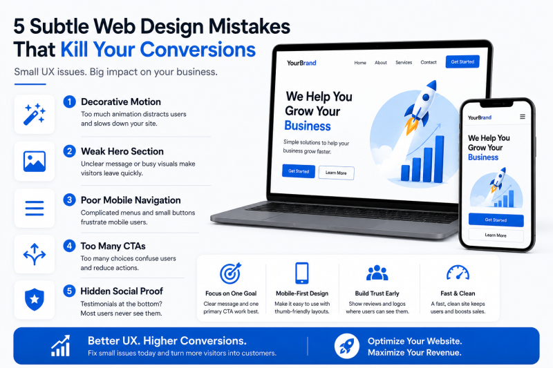
5 Subtle Web Design Mistakes That Are Quietly Killing Your Conversion Rate
 Dheeraj Sharmaa
You are pouring money into paid ads, optimising your SEO, and publishing top-tier content. Traffic is hitting your website, yet your revenue charts remain stubbornly flat. When a beautiful website fails to convert, it is rarely due to a single catastrophic error. Instead, it is usually the result of microscopic UX friction points that frustrate users enough to make them leave.
In modern digital marketing, user expectations are higher than ever. A website can no longer look pretty; it must actively guide a user toward a transaction.
If you want to turn dead-end traffic into sales-ready leads, you need to eliminate these five subtle web design mistakes that are quietly tanking your conversions.
1. Decorative Motion Without Strategic Purpose
Subtle animation and micro-interactions are excellent tools for giving flat designs a premium feel. However, many websites cross the line from helpful visual feedback into chaotic distraction.
If your pages feature text that glides in slowly from the side, heavy parallax scrolling, or icons that rotate constantly, you are increasing your visitors' cognitive load. Worse yet, heavy JavaScript animations delay content rendering, hurting your Core Web Vitals and overall site speed.
The Fix: Use motion sparingly and with absolute intent. Animation should only exist to confirm a user action (like a button pulsing gently when hovered over) or to guide the eye toward your primary Call-to-Action (CTA). Keep response times under 100ms so the site feels snappy and intuitive.2. Destructive "Hero" Images That Bury the Value Proposition
The space "above the fold" on your homepage is the most valuable digital real estate you own. Unfortunately, many companies waste this space by using vague, abstract stock photography or giant, slow-loading video backgrounds that lack clear text overlay.
If a user lands on your site and has to scroll down just to figure out what you sell or how you solve their problem, they will bounce. Visually overwhelming backgrounds pull the user's attention away from your headline and primary button.
The Fix: Partnering with the Best Web Design Agency in USA ensures your hero section balances visual aesthetics with conversion psychology. Keep your hero background clean, use strong contrast for typography, and ensure your core value proposition is readable within the first two seconds of page load.3. Disconnected, Complex, and Rigid Mobile Menus
Many platforms are still built with a desktop-first mindset, with the mobile version treated as an afterthought. Simply shrinking a desktop navigation layout into a standard hamburger menu icon often leads to poor touch-target sizing and frustrating navigation paths.
With over 70% of modern web traffic originating from mobile devices, a clunky mobile drawer that requires precision clicking will cause users to abandon their shopping carts or intake forms.
- The Thumb-Zone Reality: Most users browse single-handedly. If your crucial navigation links are tucked away at the very top edge of a massive phone screen, you are adding structural friction.
- The Fix: Shift your creative workflow to a mobile-only mindset. Design your mobile interfaces for thumb-friendly interaction. Ensure all navigation buttons meet the standard 48x48px minimum target size and place your most critical actions near the bottom or middle of the screen where thumbs naturally rest.
4. Choice Overload (The Paradox of Too Many CTAs)
When business owners want to cover all their bases, they often fill a single landing page with multiple competing requests. You might see a "Schedule a Call" button right next to a Download our E-book link, alongside a Chat with an AI Assistant pop-up.
When you present users with too many choices, they experience decision paralysis. Instead of choosing one path, they often choose to leave entirely.
[Too Many Buttons] ──► [Decision Paralysis] ──► [User Abandons Site] The Fix: Every high-converting landing page must have one primary goal. If the purpose of the page is lead generation, make that single CTA prominent, using generous whitespace around it to isolate it from secondary links.5. Burying Social Proof at the Very Bottom
Displaying case studies, client logos, and star ratings is essential for building trust. However, placing your testimonials section at the absolute bottom of a long scroll means the vast majority of your traffic will never see it.
Trust signals need to be integrated into the design layer early, establishing your authority before you ask the user to pull out a credit card or fill out an inquiry form.
The Fix: Weave social proof directly into your initial content blocks. Place a subtle row of trusted client logos or a 4.9/5 stars based on 500+ reviews badge right underneath your main hero headline. This immediately lowers customer hesitation before they even begin to read your copy.Optimize Your Digital Strategy for Revenue Growth
The difference between a website that looks good and one that scales revenue comes down to conversion-focused UX precision. Removing these invisible friction points requires a deep understanding of user psychology, mobile responsiveness, and clean performance optimisation.
If you are ready to stop buying dead-end clicks and start scaling real business growth, your platform needs an upgrade. Work with the Best Web Design Agency in USA to audit your current system, eliminate conversion leaks, and build a world-class digital experience that turns traffic into revenue.
Source:
Click for the: Full Story
You might like


You Might Like this