

 Close Menu
 World
World
 Biography
 Health
 Education
 Business
 Lifestyle
 Sports
 Technology
 Animals
 History
 Food
Food
 Religious
 Startups
 Movies
 Politics
 Fashion
 Covid
Covid
 Diet
Diet
 Fitness
 Marketing
 Travel
 Science
 Reviews
 Social media
 Stories
 Facts
Facts
 Art
Art
 Entertainment
maria smith

Technology
Responsive Web Design Is Not About Screens — It Is About Trust
 maria smith
The Article
There is a moment every mobile user knows. You tap a link, the page loads, and you immediately know — before you have read a word — that this website was not built for you. The text is tiny. The buttons overlap. The images bleed off the edge of the screen. You leave.
You do not think 'this website has poor responsive web design.' You think 'this company does not care.' And you are probably right.
Responsive design has been a technical standard since Ethan Marcotte defined it in 2010. In 2026, it is a baseline expectation — and businesses that still fail to meet it are paying a measurable price in search rankings, conversion rates, and customer trust.
The Numbers That Made Responsive Design Non-Negotiable
Mobile devices now account for more than 60% of all global web traffic. Since Google implemented mobile-first indexing, the mobile version of a website serves as the primary basis for crawling, indexing, and ranking — not the desktop version. A site that looks and performs well on desktop but poorly on mobile is effectively invisible in search.
The conversion implications are equally direct. Research cited across multiple conversion optimisation studies shows that responsive websites achieve an 11% higher visitor-to-buyer conversion rate compared to non-responsive counterparts. A one-second delay in mobile page load has been associated with a 7% reduction in conversions, which at any significant traffic volume translates to material revenue loss.
According to data from Hostinger's web design statistics research, 53.8% of web designers cite lack of responsive design as the primary reason for recommending a full website redesign. It is not content quality, not branding, not SEO — it is responsiveness.
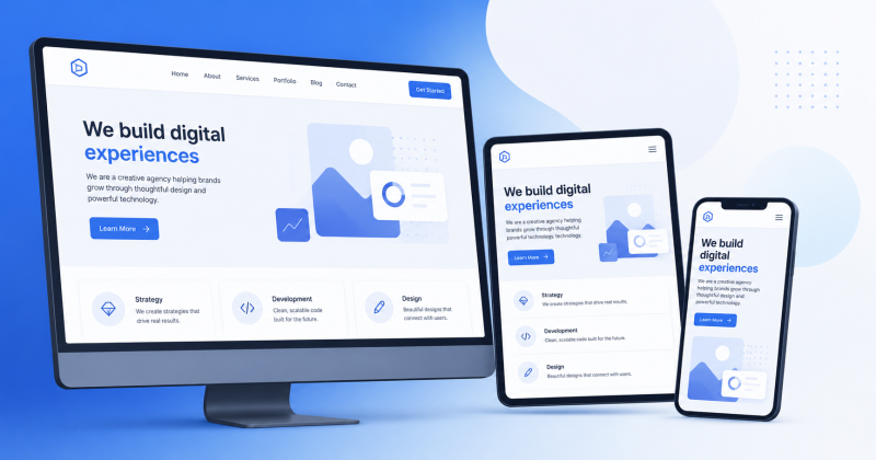
What Responsive Design Actually Means in Practice
The term 'responsive web design' describes a technical approach where a website's layout, typography, images, and interactive elements automatically adapt to the screen size of the device displaying them. Rather than maintaining separate URLs for mobile and desktop versions (a pattern that introduces SEO and maintenance complexity), a responsive site uses one codebase that behaves differently depending on the context.
The core technical mechanisms are CSS media queries (which apply different style rules at different screen widths), fluid grid layouts (which use percentage-based widths rather than fixed pixel values), and flexible images (which scale within their containers rather than overflowing them).
Modern responsive web design goes beyond this foundational layer. It incorporates touch-target sizing (buttons large enough for finger interaction), font scaling that maintains readability at small sizes, performance optimisation for mobile network conditions, and accessibility compliance with WCAG standards that serve users with disabilities alongside the majority of mobile users.
Mobile-first is not a design trend. It is the default state of how most humans access the internet. Designing for anything else first is designing for the exception.
Mobile-First vs Responsive: A Distinction Worth Making
These terms are often used interchangeably, but they describe different approaches with different outcomes.
Responsive design, in its traditional form, begins with a desktop layout and applies CSS rules to reformat it for smaller screens. Mobile-first design begins with the mobile layout — the most constrained version — and then scales up for larger screens.
The distinction matters in practice. Desktop-first responsive design often involves hiding content on mobile, compressing columns, and making trade-offs that degrade the mobile experience. Mobile-first design forces the question 'what absolutely must be on this screen?' before any design decisions are made — which consistently produces cleaner, more focused experiences on all screen sizes.
With mobile traffic exceeding 60% across most industries in 2026, starting with mobile constraints is no longer a progressive practice — it is simply accurate prioritisation.
How Responsive Design Affects SEO
The relationship between responsive design and search engine performance operates through several mechanisms:
• Google's mobile-first indexing: Google crawls and evaluates the mobile version of a site. A site with a broken mobile experience has a broken version in Google's index, regardless of how the desktop version performs.
• Core Web Vitals on mobile: Google's performance metrics are measured separately on mobile and desktop. A site that passes CWV thresholds on desktop but fails on mobile still carries the ranking penalty.
• User behaviour signals: Bounce rate, session duration, and pages per session are all influenced by mobile UX. Poor responsive design drives up bounce rate on mobile, which signals to search engines that the page did not satisfy the user's intent.
• Page speed: Responsive design, when properly implemented with mobile-optimised images and lean CSS, improves page load speed on mobile connections. Speed is a direct ranking factor.
The compounding effect is significant. A site with a poor responsive design is simultaneously penalised in rankings (reducing visibility) and loses a higher proportion of the traffic it does receive (reducing conversion). Both revenue streams — organic discovery and conversion of existing visitors — are damaged simultaneously.
The Accessibility Dimension Most Teams Miss
There is a dimension of responsive design that rarely appears in purely commercial discussions: accessibility. Screen readers, keyboard navigation, and assistive technologies are used by a significant proportion of internet users — estimates vary, but figures consistently exceed 10% of the global population when including people with temporary or situational impairments.
WCAG 3.0 accessibility standards, increasingly referenced in both legal contexts and Google's quality guidelines, require specific considerations in layout, colour contrast, touch target sizing, and focus management. These requirements overlap substantially with responsive design best practices, meaning that an investment in properly built mobile-first web design typically also improves accessibility compliance — two outcomes from one well-executed effort.
What a Well-Executed Responsive Audit Looks Like
For sites that need to assess and improve their responsive design without a full rebuild, a structured audit covers the following:
• Real device testing across common screen sizes: Emulators are useful but insufficient. Physical testing on at least one iOS device, one mid-range Android device, and one older-generation Android device reveals issues that emulators normalise.
• Core Web Vitals measurement via Google PageSpeed Insights: Segment the results by mobile and desktop. Address the mobile failures first.
• Tap target analysis: Google's Search Console identifies pages where buttons and links are too small or too close together for reliable mobile interaction.
• Content parity check: Confirm that no content visible on desktop is hidden on mobile for convenience. Content removed from the mobile view is effectively absent from Google's index.
• Form and checkout flow testing: These are the highest-stakes interactions and the most common source of mobile conversion failures. Every input field, dropdown, and submission button should be tested on a real mobile device.
Frequently Asked Questions
Does responsive web design affect page speed?
It can improve it or worsen it depending on implementation. A well-built responsive site serves appropriately sized images for each device and avoids loading desktop-sized assets on mobile. A poorly implemented one may still load all assets regardless of screen size, which hurts mobile performance. The implementation approach matters more than the label.
Is a separate mobile site ever preferable to a responsive design?
Rarely, in 2026. Separate mobile sites (m.dot subdomains) require maintaining two codebases, create SEO complexity around canonical tags and crawl equity, and often fall behind the main site in feature parity. For large-scale e-commerce sites with complex checkout flows, there may be edge cases — but for the majority of businesses, a single responsive codebase is technically superior.
How does Google's mobile-first indexing work?
Google primarily uses the mobile version of a site's content for indexing and ranking. Its crawlers simulate a mobile user agent when evaluating pages. If the mobile version loads slower, has less content, or has different metadata than the desktop version, the mobile version's characteristics are what Google indexes.
What tools are best for testing responsive design?
Google PageSpeed Insights (for Core Web Vitals), Chrome DevTools device emulation (for visual testing), BrowserStack (for real device testing across many configurations), and Google Search Console's Mobile Usability report (for SEO-specific issues) together cover the most important diagnostic scenarios.
The Business Case, Measured in Real Numbers
Responsive design is not a technical nicety. The data assembles a clear picture: more than half of web traffic is mobile, Google ranks mobile versions first, users who encounter broken mobile experiences leave immediately, and those who have smooth ones are measurably more likely to convert.
Every percentage point of improvement in mobile conversion rate has a direct revenue equivalent. Every improvement in mobile Core Web Vitals has a compounding effect on search visibility. The return on investing in properly built, mobile-first responsive design compounds over time in a way that few other technical investments do.
The question is not whether a business can afford to prioritise responsive design. It is whether it can afford not to.
Source:
Click for the: Full Story
You might like